Simple and customizable button in Swift.

Cocoapods
pod 'SwiftyButton'
Carthage
github 'TakeScoop/SwiftyButton'

let button = FlatButton()
button.color = .cyan
button.highlightedColor = .blue
button.cornerRadius  = 5
let button = PressableButton()
button.colors = .init(button: .cyan, shadow: .blue)
button.shadowHeight = 5
button.cornerRadius = 5Here is a list of all the properties that you can modify. Those are all editable directly from Interface Builder. See FlatButton.Defaults or PressableButton.Defaults to set defaults for those properties.
button.color = .cyan
button.highlightedColor = .cyan
button.selectedColor = .blue
button.disabledButtonColor = .gray
button.cornerRadius = 8button.colors = .init(button: .cyan, shadow: .blue)
button.disabledColors = .init(button: .gray, shadow: .darkGray)
button.shadowHeight = 10
button.cornerRadius = 8
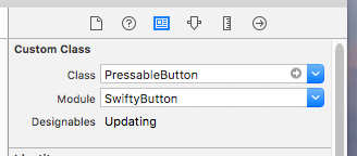
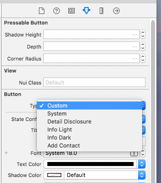
button.depth = 0.5 // In percentage of shadowHeightAdd a UIButton as usual, then:
- Modify the underlying class to
FlatButton/PressableButton, and that the module is set toSwiftyButton - Make sure that the button type is set to
Custom
You can set defaults that will be applied for any new instance of SwiftyButton by modifying the FlatButton.Defaults or PressableButton.Defaults structure:
FlatButton.Defaults.color = .cyan
PressableButton.Defaults.cornerRadius = 8
...
Use CustomPressableButton to add custom content in a Swifty Button.
This is a subclass of SwiftyButton that exposes a content view that moves when the button state changes. All you have to do is add your views inside button.contentView and setup layout constraints relative to this view.
pod `SwiftyButton/CustomContent`
Here is how you would create a button similar to the one above (here we used PureLayout for constraints):
let button = CustomPressableButton()

let indicator = UIActivityIndicatorView(activityIndicatorStyle: .white)
button.contentView.addSubview(indicator)
indicator.autoPinEdgesToSuperviewEdges(with: UIEdgeInsets(top: 10, left: 15, bottom: 10, right: 0), excludingEdge: .right)
indicator.startAnimating()

let label = UILabel()
button.contentView.addSubview(label)
label.autoPinEdgesToSuperviewEdges(with: UIEdgeInsets(top: 10, left: 0, bottom: 10, right: 10), excludingEdge: .left)
label.autoPinEdge(.left, to: .right, of: indicator, withOffset: 10)
label.text = "Loading..."
label.textColor = .whitePressableButtononly works with plain colors (no alpha / transparency) because of the way its background image is rendered. See #2PressableButtonmanages title and image insets automatically (titleEdgeInsetsandimageEdgeInsets). See #5- User-specified inset values for
topandbottomwill be overridden. - You may specify inset values for
leftandright.
- User-specified inset values for
Look at the Examples folder to see more button examples.
This project is copyrighted under the MIT license. Complete license can be found here: https://github.com/TakeScoop/SwiftyButton/blob/master/LICENSE
- Inspired by HTPressableButton: https://github.com/herinkc/HTPressableButton
- Colors used in examples come from https://flatuicolors.com/